On The Lord of the Rings blu-ray extended edition there are a ton of feature I haven't seen. one of which it about digital grading (colour grading) as I'm developing my visual approach to make my images look like film still this is something i had to watch bellow are my notes as i pause the feature.
Peter Jacksons first time using colour grading he found New Zealand a beautiful place but it still was a country he wanted to look mythical.
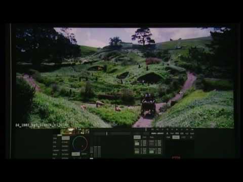
Filmed on 35mm film scanned the film into the computer using a huge machine colour graded the image adjusting the highlights, shadows, colours, and in this grading they also isolated faces and parts of the scene to specifically adjust that part. once the grading is done it's then then scanned back onto a negative.
Peter Doyle graded the film, Doyle also done The Matrix.
70% of the colours digital graded.
Mordor shots wanted to feel ancient, while Hobbiton green and warm to achieve this instead of adding green, magenta - red was added.
Removed the warm orange colours of the Prancing Pony Inn from the fire place and added a ill green a "urine stained" (quoted from Peter Jackson) colour to make the the place feel run down.
Because of colour grading they were able to match the CGI colours to the scene or vise versa thats how they blend so well.
Moria held death of many Dwarfs so for this the image monochromatic, heavily desaturated so the only colours was a slight orange from a flame, flesh tones and a green cast in some of the shadows.
Again masking off areas of people face to direct more attention to them but keeping it subtle.
In forest scenes they got a average exposure, then in post warmed the green leaves, making them more golden, then masked off the foreground and lighten that.
Watching that 12 minute feature was a spectacular insight to make The Fellowship of the Ring. I see areas of being able to apply this to my photography, when i grade my images i look at it as a whole, for Lord of the Rings, they selected characters masked there face to direct you to them, I need to think where i want the viewer to look? and use grading to help direct the viewer there.
For my BA6 project the feeling across to very important, the different feeling and look they wanted effected the grading they used I need to experiment over the summer with gradients and feelings as all my BA6 was green.


No comments:
Post a Comment